
Are UK Government Covid-19 statistics subject to manipulation? If so, whose hand is on the data? Senior medical statistician James Urquhart examines a mystery and possible malfeasance. Why is the UK nation with the worst track record relaxing restrictions fastest?
Who controls the past’ ran the Party slogan, ‘controls the future: who controls the present controls the past.’ George Orwell
A strange event happened on June 1 2020. The UK Government announced a revised figure for the total UK Covid-19 deaths to include 445 additional deaths. At the daily briefing, however, these new data were not incorporated into the graph of the 7-day moving average.
Strange? Surely this was just the monthly catching up exercise. An effort to answer criticisms that the Government hasn’t always made proper use of data. After all, wasn’t a similar data catching up exercise carried out at the end of April?
Monday June 1 was the day the Government relaxed the lockdown in England and the foremost question was whether there was evidence from the data that this relaxation had been premature. So, not surprisingly, the change in the data was subject to some scrutiny. But Matt Hancock, UK health secretary, was almost passionate about the importance of keeping the data updated and the scrutiny moved on to other matters.
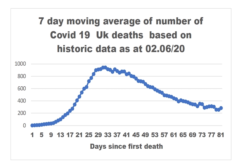
The graph of the 7-day moving average released on June 2 did incorporate the historic data. But this was now yesterday’s story and it was therefore not readily apparent that, whether by accident or design, the data amendments had created a change in the visual impact of the moving average graph.
Figure 1 shows what the graph of the UK 7-day moving average of deaths would have looked like if the historic data had not been revised.
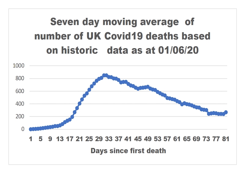
Any eagle-eyed journalists Zooming into the briefing could surely have pointed out that the decline in the number of deaths had flattened out and indeed at the last data point had risen in fact to a level higher than seven days before. Fortunately for Hancock, who for some unexplained reason had for the first time taken over the role of presenting the data, the graph derived from the revised data (albeit a little odd) was much more on message.
Figure 2
Of course, it might be that the changes were instituted entirely in good faith and were not a panic reaction to the sudden realisation that the June 2 death figure was set to be 10% higher than that for the preceding Tuesday. But the change does leave enough of a nagging doubt to prompt further examination of the data revisions. The daily data revisions themselves have not been published. So our only recourse is to go back to the data sets from the daily briefings and other sources to make comparisons.
Data sets
The first thing to note is that the UK daily death data is a composite of a variety of data sets held by different authorities in each of the home nations and that each of these data sets seems to be subject to continuous update using different criteria. Whilst each statistical authority might claim to have some form of audit trail for data changes they make, the overall effect is somewhat chaotic. It should be noted also that although the UK death data have been updated twice no attempt has been made to incorporate deaths identified by death registration.
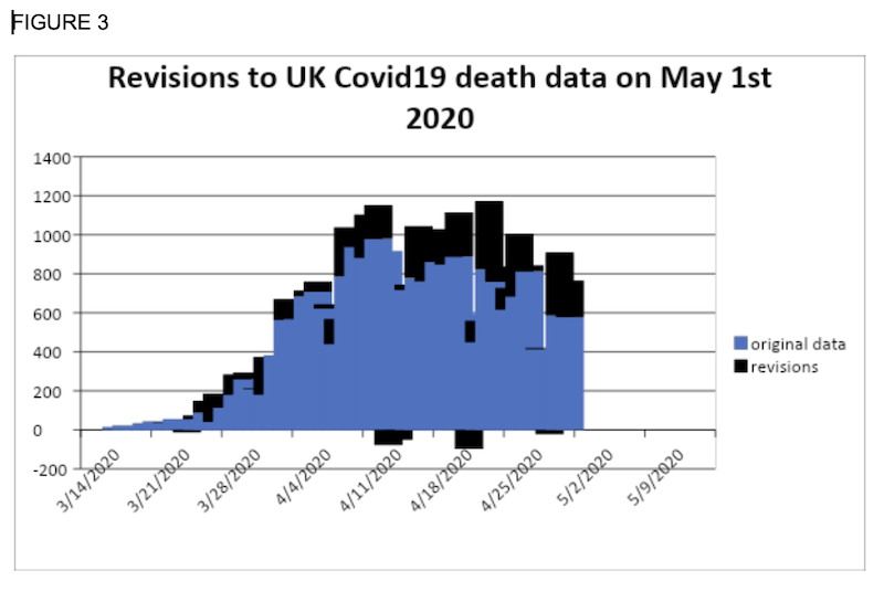
The first substantial revisions of the data were carried out on May 1. The revisions are shown in Figure 3 and suggest that a detailed attempt was made to update each daily figure going back to March 15. On only two of the 45 days up to April 30 were no revisions made and on five days figures were actually revised downwards. The conclusion has to be that this was a serious and properly conducted statistical exercise in which every effort was made to attribute each death to the appropriate date.
Contrast the end of April exercise with that conducted on June 2. (Figure 4)
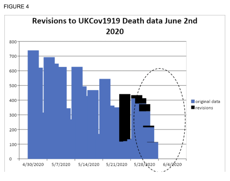 Out of a possible 76 days, revisions were made on just six days which are shown in greater detail in figure 5.
FIGURE 5
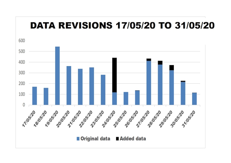
Of the 445 additional deaths no less than 323 were added to the data for Sunday May 24, increasing the death data for that day by a stonking 273%.
Fly tipping
It is very difficult to envisage a rational explanation for why the data for May 24 required such a dramatic revision. Rather, it would appear that it was chosen as a good day for what can only be called statistical fly tipping – fly tipping which in this case changed the statistical landscape in ways some might have seen as being to their advantage.
The sad thing, from the perspective of those who care about statistical integrity, is that if this was indeed data manipulation, a very large price has been paid to achieve very little. The change in the visual impact of the 7-day moving average graph might have avoided a short term and relatively minor embarrassment for whoever was occupying the podium on 2 June.
The price to be paid is a suspicion of statistical malfeasance and a consequential further erosion of trust at a time when the UK Government’s credibility on the use of data is already being questioned.
Every record has been destroyed or falsified, every book rewritten, every picture has been repainted, every statue and street building has been renamed, every date has been altered. And the process is continuing day by day and minute by minute. History has stopped. Nothing exists except an endless present in which the Party is always right. (Orwell)
The heresy of comparison
After an hour’s fruitless searching the helpful stranger asked the man if he was sure that he had dropped his key by the lamppost. “Oh no,” said the man, “I lost it over there”. So why are we searching under the lamp-post? asked his exasperated Good Samaritan. “Because”, said the man, “it’s dark over there” (Orwell)
The strange data revisions on June 2 prompt a further examination of how the daily death data is being employed.
The four home nations of the United Kingdom publish data each day at different times and to different criteria. All four publish data for people who have tested positive for Covid 19 but the are variations in the settings that are incorporated. This difference in approach makes comparisons between England and the other home nations more difficult but not impossible. Later in the day, at the daily briefing, we are presented with the UK data from which the other three nations’ data can be subtracted to give the English data. For some reason it is the UK data which ministers choose to use in support of policy decisions which relate only to England.
A bizarre feature of the discussion about national and international comparisons is that where they have been attempted, everyone has appeared content to make comparisons based on absolute numbers. It is as if we have fallen into an alternative reality in which the calculation of even the crudest death rate is considered in very bad taste if not actually another breach of the Covid-19 regulations. And, clearly, in this alternative world any serious attempt to introduce age standardisation – allowing for different age structures in different populations – into the calculation would have to be done in secret and the results nailed in the dead of night to the door of whichever ministry was currently occupying the daily briefing podium.
So at risk of being denounced for heresy let us explore what can be gleaned from analysis of the four nations’ data sets and an international comparison.
Figure 6 shows a comparison of Covid-19 age standardised death rates in England and Italy.
FIGURE 6
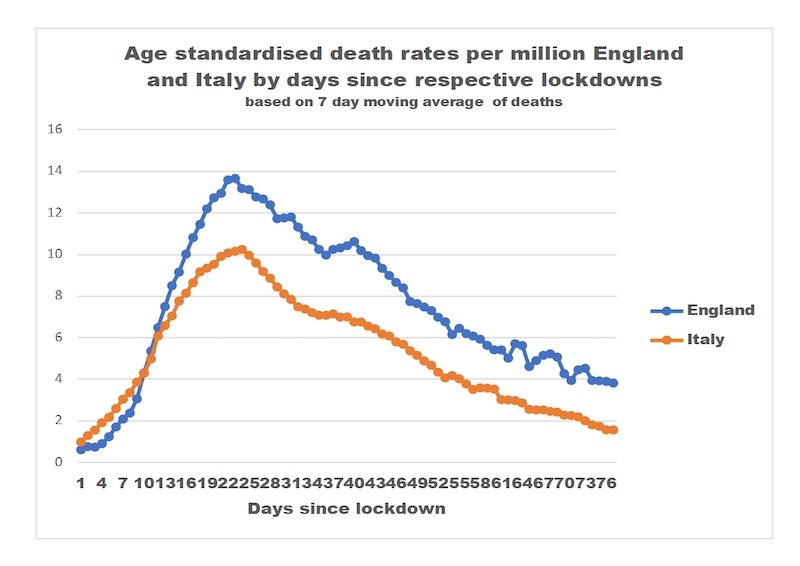
Broadly speaking, the incidence curves for the two countries follow a similar pattern: a steep rise in cases to a peak is succeeded by a much flatter decline. This pattern is found in the data from several other countries where a relatively high number of cases has led to lockdown. It is also seen in many of the predictive models for the virus.
The UK Government has been keen to suggest that international comparisons of this kind are undesirable because of differences in the way in which data are collected. Such differences in data collection criteria undoubtedly exist but are unlikely to account for deaths in England at the peak being about 40% higher than the equivalent datum for Italy or being more than double the Italian rate 73 days after the respective lockdowns. And it should be noted also that because the English data does not incorporate deaths identified by the registration process that peak figure for England will if anything be much higher.
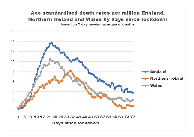
Comparisons between the four home nations might be expected to be less influenced by data collection disparities than international comparisons. Thus, for example, the graph of age standardised death rates for Wales has a similar shape to that for England but the Welsh rates have been consistently much lower than England’s since lockdown. It is clear also that performance in Northern Ireland has been consistently much better than is the case in England. (Figure 7)
FIGURE 7
Scottish ‘success’
Scotland’s data presents us with something of an anomaly. At the time of lockdown, Scotland appeared to have a lower number of deaths than England. But after nine days the number of deaths accelerated in parallel with England. From day 21, the death rate in Scotland appeared to have plateaued without reaching a true peak until at about day 50 it had caught up with the declining rate in England. Subsequently, however, the Scottish rate has declined more steeply than is the case in England to bring it close to the rate in Northern Ireland. (Figure 8). The weekly data for the two countries suggests a broadly similar pattern although the differences at the peak seem less pronounced.
FIGURE 8
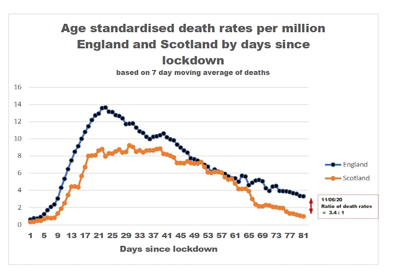
How are the Scottish data to be explained and, in particular, the failure of the death rate to decline at day 21? It is worth noting that day 21 was the 12th of April or just two days after Jeane Freeman, the Scottish Secretary for Health, announced the “success” of the removal of large numbers of “delayed discharges” from hospital during March and early April. Despite the long-term obsession of the Scottish Government with reducing “delayed discharges”, the problem has proved intractable over many years, not least because it is a symptom of the much much wider problem of inadequate local government funding. So, it is hard to understand how this “success” could have been achieved overnight.
The truth is that the large-scale “freeing up” of hospital beds was a direct response to the political decision taken across the UK to set a single strategic objective for dealing with the pandemic: preventing the NHS from being “overwhelmed” ahead of protecting people’s lives. (That political choice goes to the heart of the debate about when lockdown should have begun.
There is little doubt from other studies that have been conducted that these discharges have been associated with a very high number of deaths in care homes and possibly other community settings. The plateauing of Scottish deaths from Day 21 to about day 50 would seem entirely compatible with an explanation that this was caused by elevated care home deaths. Put simply: any advantage that Scotland may have had from an effectively slightly earlier lockdown was lost because of its hospital discharge policies.
But to return to the mystery of why up to now no-one has considered it important to make age standardised death rate comparisons between the four home nations. This omission seems particularly glaring when one considers the relative death rates on June 1st, the day the UK Government encouraged relaxation in England – a lead that was not followed by the other three nations who chose to stick to a more cautious approach. Because, on England lockdown relaxation day, the age standardised death rate in England was more than double that in any of the other three home nations. And, by June 11, the date when England announced further relaxations, the differential between English and Scottish death rates had stretched to a factor of more than three. Perhaps these facts alone provide the answer to our other mystery of why the UK Government chooses to use UK data to support policy decisions for England.
In conclusion there must be real concerns about the way in which the UK Government captures, analyses and utilises data. But these concerns and indeed the limitations of the data themselves should not prevent us from seeking to make important comparisons between the home nations. The UK Government’s insistence on using UK death data to support its policy announcements for England has obscured the facts that Covid19 death rates, when the latest round of relaxation in England began, were much higher than those in the other home nations. National comparisons also reveal worrying insights into a pattern of raised mortality in Scotland which can be associated with Scottish hospital discharge policies which stem from a political choice about strategic objectives..
It was quite simple. All that was needed was an unending series of victories over your own memory (Orwell)
Further reading: Scotland’s missing Covid-19 paper trail: 5 questions.., Source Direct, June 4; Scotland’s record flattered by contrasts with south, FT, June 2;
Featured image, Jeane Freeman, Scottish health secretary, at June 8 press briefing, via Scottish government flickr, CC BY-NC 2.0
Leave a Reply